You finish college, open a blank resume, and suddenly every font on earth looks like a life decision. Then you ask five people for advice and get seven different opinions, half of them delivered with the confidence of someone who once got hired and now thinks they invented hiring. This guide is for freshers in India who want a resume that actually survives recruiter scans and ATS filters, not one that looks “creative” in a way that quietly ruins your chances. In 2026, recruiters care less about decoration and more about whether your resume makes your fit obvious in a few seconds. That is the whole game. Annoying, yes. Still the game.
The thing nobody actually says out loud
A fresher resume is not a biography. It is not a personality test. It is a sales page for one thing only: “Why should someone call you first?” Most people write their resume like they are trying to prove they are a complete human being, which is adorable and also useless. Recruiters are not looking for your life story. They are scanning for role fit, skills, education, project proof, and a layout that does not make them feel tired before lunch.
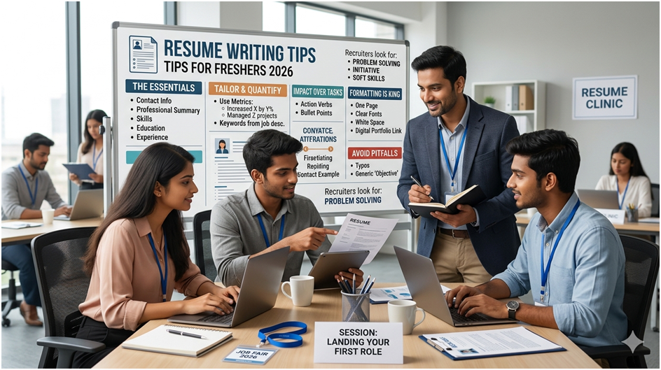
A fresher resume wins when it makes weak experience look organized, not when it pretends weakness does not exist. That is the part people avoid because it sounds less glamorous than “stand out from the crowd.” The truth is simpler. Recruiters care whether you can do the job, learn fast, and communicate clearly. In 2026, that often means ATS-friendly formatting, role-specific keywords, and evidence that you have done something beyond attending classes and surviving group projects.
The thing most freshers miss is that a resume is not judged in one clean read. First, it gets filtered by software. Then it gets skimmed by a recruiter. Then, maybe, it gets a human look. That means your resume has to survive three different levels of impatience. Fancy design often dies at level one. Generic wording dies at level two. Empty claims die at level three. A resume that survives all three is usually simple, specific, and mildly boring in the best possible way.
Think of it like ordering food on a delivery app. If the title, photos, and price are confusing, people skip it. Your resume works the same way. If the role, skills, and proof are not obvious fast, it gets ignored. Nobody is reading your “passionate, hardworking, dynamic” sentence with tears in their eyes.
How this actually works: the real mechanics
Recruiters do not read fresher resumes the way students imagine. They scan for signals. Role title. Relevant skills. Proof of work. Education. Location. Contact details. That is the order of gravity in most cases, and if your resume buries these details under design clutter, you are making their job harder for no reason.
The biggest structural shift in 2026 is that ATS-friendly, single-column formats are still the safest bet for freshers applying through portals and company systems. Two-column layouts, decorative icons, and skill bars may look polished, but they often create parsing problems. Translation: the software may not read them correctly, which means the recruiter never sees the thing you thought was clever. Yes, the pretty template can cost you the interview. That is how unserious design mistakes turn into real losses.
Here is the practical logic behind a fresher’s resume:
- Your header should be boring and correct. Name, phone, professional email, city, LinkedIn, and portfolio if relevant. Recruiters do not need your life history in the header, and they definitely do not need a dramatic email address from school days.
- Your summary should be role-specific. “Hardworking and motivated” is not a summary. It is wallpaper. A better summary says what field you are in, what skills you bring, and what role you want.
- Your projects often matter more than your internship count. A solid academic project with tools, process, and outcome can beat a vague internship that added nothing useful.
- Your skills should match the job posting. If the posting says Excel, SQL, and PowerPoint, those terms should appear if you genuinely know them. Keywords matter because ATS systems rank resumes partly on matching terms.
- Your education section should be readable and simple. Degree, college, year, and relevant coursework if it helps. Nobody needs a suspense novel.
- Your achievements should prove something. “Organized a fest” is fine if it shows leadership or coordination. “Active participant” is basically decorative oxygen.
The niche part that generic guides ignore is this: freshers often write resumes for their own ego, not for the job description. That is why the same resume gets sent to software roles, operations roles, and sales roles with only the company name changed. Recruiters can smell that from three scrolls away. The resume should change with the role. Not wildly. Just enough to show you are not copy-pasting your future.
And one more thing. In India, many freshers apply from mobile and job portals first, not from a polished laptop portfolio. That means your resume has to survive tiny screens and fast decisions. If a manager opens it on a phone and cannot spot your field in ten seconds, you have already made them work too hard.
Comparison of what’s actually different
| Option | What it actually does | Who it’s for | The catch |
| ATS-friendly single-column resume | Makes your resume easier for software and recruiters to read | Most freshers applying online | It can feel plain if you overthink aesthetics |
| Two-column / design-heavy resume | Looks polished and modern at first glance | People applying to creative roles with manual review | ATS may misread it, and that is a stupid way to lose chances |
| Project-led fresher resume | Shifts attention to work samples, tools, and outcomes | Students with internships, projects, or certifications | You need actual proof, not just skill labels |
My recommendation: use the plain ATS-friendly format unless the role clearly wants visual creativity. For most freshers, simple wins because readable beats decorative. If your content is weak, design will not save it. If your content is strong, design can still ruin it.
What actually happens when you try this
When you actually rebuild a fresher resume properly, the first thing you notice is how much junk disappears. That is a good sign. The version that looked “complete” before was usually full of low-value lines that only existed to make you feel employed. Once you cut them, the resume gets shorter, cleaner, and much more believable.
The thing that surprises most freshers is how little space they actually need. One page is still the safest length for most freshers in 2026. That feels unfair when you have spent years collecting certificates like souvenirs. But recruiters do not reward volume. They reward clarity. If you can explain your skills in one page, that is a stronger signal than needing two pages to sound competent.
A pattern I keep seeing is that freshers overstate soft skills and understate proof. Everyone is “team-oriented,” “hardworking,” and a “quick learner.” Fine. So is every other applicant. What stands out is a project where you used Excel to analyze data, a GitHub link that shows code, a campaign you helped run, or a measurable result from an internship. Proof makes your claims feel real. Without proof, the resume starts sounding like a motivational quote that was applied to a job.
The other pattern nobody says clearly enough is that many freshers leave the summary generic because they are afraid of narrowing themselves too early. That fear is backwards. A targeted summary does not trap you. It tells the recruiter what you want. You can still apply elsewhere. The resume just has one job: help you get a callback today.
What nobody warns you about is the mental shift. The moment your resume becomes specific, it stops feeling like a school project and starts feeling like a market document. That is uncomfortable for some people. Good. It should be. That discomfort usually means you are finally writing for the reader, not for your own sense of completeness.
The advice everyone gives vs what works
“Add every skill you know.” No. That is how resumes become cluttered and untrustworthy. Recruiters do not need a museum of half-learned tools. They need a tight list of skills you can actually use. The better approach is to list the skills that match the role and that you can defend if asked in an interview.
“Use a fancy template to stand out.” That advice is popular because it sounds smart. In reality, it often fails ATS parsing and distracts from the content. If you are applying through portals, a clean layout beats visual noise. Stand out with the quality of your content, not the presence of a neon sidebar.
“Write a long objective to show ambition.” Ambition is not the problem. Bloat is. A long objective wastes space and says very little. A short summary or objective that names your field, strength, and target role works better. Recruiters want direction, not a speech.
“Put hobbies to make it personal.” Sometimes useful, mostly filler. Unless the hobby genuinely supports the role, like coding projects, writing, design, volunteering, or sports leadership it adds very little. A recruiter is not hiring you because you enjoy chess unless the job somehow cares. Keep hobbies only if they help the story.
“Send the same resume everywhere.” This is the lazy one. It saves time and kills response rates. Different roles pull different keywords and different proof points. The better move is to make a master resume, then edit it for each application. That is boring. Also effective. Funny how that works.
The practical part of what to actually do
Start with a one-page master resume. Put your name, contact details, summary, education, skills, projects, internships, and achievements in a simple order. Do not start with design. Start with information. The formatting comes after the content is clear.
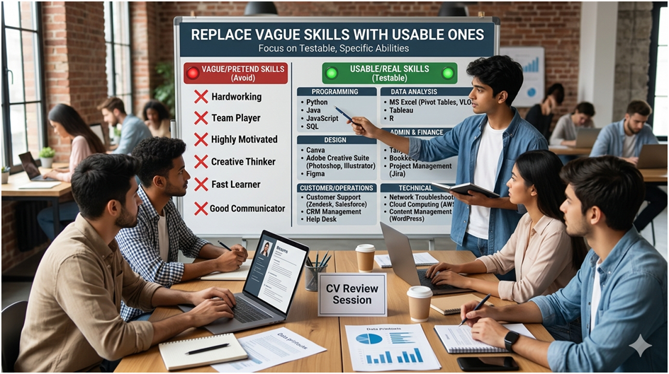
Rewrite your summary for the role you want. If you are applying for an analyst role, mention data, Excel, SQL, reports, or dashboards if those are relevant. If you want a sales role, mention communication, lead handling, CRM, or target-based work if you have done it. The summary is a signal, not a poem. Replace vague skills with usable ones. “Hardworking” is not a skill. “Python,” “MS Excel,” “Canva,” “Java,” “Tally,” or “Customer support” are skills people can understand and test. Keep the list honest. Recruiters would rather see six real skills than twenty pretend ones.
Add one solid project with details. Name the project, say what tools you used, and explain what you built or learned. If you improved something, say how. If you analyzed data, say what was analyzed. That is the fastest way for a fresher to look less empty.
Cut anything that does not help shortlisting. Full address, father’s name, unnecessary personal details, and overly emotional self-descriptions usually do nothing. They take space and give nothing back. Use that room for useful proof instead.
Export as PDF unless a job post asks otherwise. PDF keeps the layout stable, which matters when recruiters open it on different devices. Then test the file on a phone. If it looks cramped there, it needs more work.
Tailor the resume before every serious application. This does not mean rewriting everything. It means adjusting the summary, skills, and project emphasis to match the job. A little customization goes a long way. A generic resume goes nowhere slowly.
Questions people actually ask
What should a fresher’s resume include in 2026?
A fresher’s resume should include contact details, a short summary, education, skills, projects, internships (if any), and achievements. Keep it simple and relevant. Recruiters want the pieces that help them judge fit fast, not your full school archive.
Is one page enough for a fresher’s resume?
Yes, for most freshers, one page is enough. If you have limited experience, stretching it to two pages usually makes it weaker, not stronger. The goal is not to fill space. The goal is to make every line useful.
Should freshers use Canva resume templates?
Usually no, unless the job is clearly creative and the design is still readable by ATS. Many Canva-style templates look good to humans but confuse resume scanners. Simple layouts do a better job for most applications.
What are the biggest resume mistakes freshers make?
The biggest mistakes are generic summaries, fake skills, too much design, and sending the same resume everywhere. Another common problem is writing about yourself instead of writing for the job. A resume is not a diary. It is a filtering tool.
Do recruiters read the objective section?
Yes, but only if it is short and relevant. A weak objective gets skipped fast, while a role-specific summary can help the recruiter understand your direction. Keep it tight. Nobody wants a paragraph that tries too hard.
Should I include photo in a fresher resume?
Only if the employer asks for it or the application format clearly expects it. For most online applications, especially ATS-heavy ones, a photo is not needed. In many cases, it adds nothing and takes up space. Clean and clear usually wins.
What keywords should a fresher’s resume have?
Use keywords from the job description that match your real skills and experience. For tech roles, that may include tools, languages, and frameworks. For non-tech roles, it may include Excel, communication, operations, coordination, or customer handling. The point is matching, not stuffing.
How do I make my fresher’s resume stand out?
Make it specific. A targeted summary, real projects, and clear skills are better than loud design. Recruiters notice resumes that feel intentional. They ignore the ones that feel copied from a template shop at 1 a.m.
Should I mention internships if they were short?
Yes, if they are relevant and you can explain what you learned or did. Even short internships can help if they show exposure to real work. A weak internship is still better than pretending it never happened. Just do not oversell it.
So where does this leave you
It leaves you with a fairly simple truth: a fresher resume is not about proving you are impressive. It is about making your fit obvious fast. That means one page, clean structure, role-specific language, real proof, and less decoration than your instincts may prefer.
The one thing you should do today is open your current resume and remove three weak lines that add no value. Then add one project detail, one role-specific keyword, and one cleaner summary. Small edits often change more than a full redesign because they finally make the resume readable by both software and humans.
This part is not glamorous. It is annoying, specific, and a little unfair. So is job hunting. The good news is that the boring version usually works better than the stylish one.
You stayed through the whole thing, which already puts you ahead of the people who keep asking why they are not getting replies. Now make the resume less loud and more useful.